Test on the Ugliest Screen You Own
Apple rejected our build for a paywall that clipped on a screen size we had never tested at. Reproducing it on an Android emulator took four minutes, found a second bug we had shipped in every build, and turned into a pre-submit rule we now run every time.
On the morning of September 3 we got an App Review rejection for ViewPane build 6 under Guideline 4.0, Design. The wording was “not optimized to support all screen sizes or resolutions,” which is vague enough to mean anything. The attached screenshot was not vague at all. It showed our Pro subscription sheet with the feature list sliced clean through the middle of the third card.
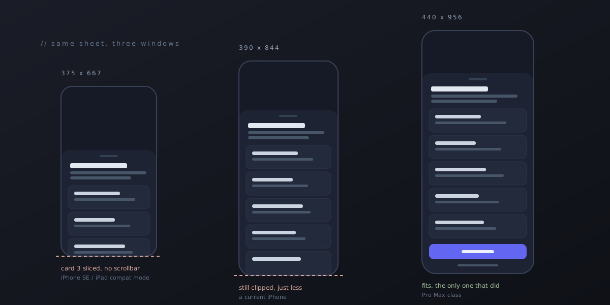
The reviewer was on an iPad Air. ViewPane is an iPhone-only app, so on an iPad it runs in compatibility mode, which gives it a window of roughly 375 by 667 points. That is the size of an iPhone SE. We had never once opened the app at that size.
Why we never saw it
Our test devices are all tall. Current iPhones run 844 points and up, current Android flagships taller still, and the emulator profiles anyone reaches for by default match them. The paywall looked great on all of them, and it looked great because all of them are tall enough to hide the bug.
The sheet was capped at 88 percent of the window height. Its content, five feature cards with a blurb each plus a header, a subscribe button, restore, legal text, and a dismiss link, added up to around 840 points. Do the division and it needed roughly a 950-point window to fit. Only the Pro Max class of iPhone is that tall. On every other iPhone the list was being clipped, and we had turned off the scroll indicator for aesthetics, so there was no hint on screen that the list scrolled at all.
So the reviewer had not found an iPad bug. They had found an every-iPhone-but-one bug, and the iPad’s small compatibility window just made it obvious enough to photograph.
Reproducing it in four minutes
The fastest reproduction was not an iPad. The bug was a layout arithmetic problem, not a platform problem, so any window with the right dimensions would do, and the quickest window to resize on demand is an Android emulator.
Two commands turn a running Android emulator into an iPhone SE-shaped canvas:
adb shell wm size 750x1334
adb shell wm density 320
That is 375 by 667 density-independent pixels, the same working area the reviewer saw. Reload the app, open the paywall, and there was Apple’s screenshot, third card sliced through the middle. Four minutes from reading the rejection to a reproduction on the desk.
When you are done, put the emulator back or every other screen you look at will lie to you:
adb shell wm size reset
adb shell wm density reset
The fix
The sheet now reads the window size and adapts in tiers instead of assuming it has room:
- Below 760 points of height, the feature blurbs go away and the padding tightens. Five rows fit with nothing clipped.
- Below 620 points, the subtitle goes too. That covers the oldest supported iPhones and the 1x iPad compatibility canvas.
- At 900 points and up, blurbs get up to three lines, since there is room to say something useful.
- The feature list has
flexShrinkset so that if some future device is shorter still, the leftover overflow scrolls instead of clipping. - Whatever feature the user tapped to open the sheet now sorts to the top, so the thing they wanted is visible without scrolling on any size.
- Windows 600 points or wider, meaning tablets, foldables, and desktop shells, get a centered card with a maximum width instead of a bottom sheet stretched edge to edge.
None of this is clever. All of it should have been there in build 1, and the only reason it was not is that we never looked at a short screen.
The second bug
Here is the part that turned a fix into a rule. While the emulator was still in SE mode we scrolled down the Settings screen to reach the paywall trigger, and stopped.
Seven rows at the bottom of Settings, Connection Diagnostics, Report a Bug, Terms of Service, Privacy Policy, Open-Source Licenses, Manage Subscription, and Restore Purchase, were all styled as one solid dark red block. Indigo text on a destructive red slab with no gaps between rows. It looked like seven ways to delete something.
The cause was mundane. Those rows had been built by reusing the style of the one genuinely destructive button on the screen, Forget All Servers, with the text color overridden. On a tall phone with the rows spread out it read as “a bit heavy.” On a short window with everything compressed it read as an error. It had shipped in every build we had ever made, and nobody had flagged it, including us.
The seven rows are now plain neutral cards with a gap between them. Red is reserved for the one button that actually destroys something. That fix took ten minutes and came out of a bug we would never have gone looking for.
The rule
Both fixes went back to Apple the same morning as build 7. That build was rejected too, for something completely different, which is a story for another post. But the layout finding stuck with us more than the rejection did, because the reviewer had not done anything exotic. They had opened the app on a screen size we had never tested.
So we added a pass to the pre-submit checklist, and it is short enough to actually run:
- Smallest window. Run the app at 375 by 667 and at 320 by 568. Open every sheet, modal, and paywall. Nothing may clip. Scrolling is acceptable. A sliced card is not.
- Widest window. Run it at 600 points wide or more. Bottom sheets should become cards. Nothing should stretch edge to edge.
- Largest text. Turn on the largest accessibility font size and repeat step 1. Primary buttons must still be reachable.
- Look at everything you scrolled past. The second bug was on the way to the first one.
The whole pass takes about fifteen minutes on an emulator and needs no hardware. It would have caught both bugs, and the three-day round trip through App Review that came with them, before build 6 was ever uploaded.
If you are a small studio shipping phone apps
Your test devices are almost certainly the nice ones. That is natural, they are the phones you carry. But the nice ones are tall, sharp, and forgiving, and they hide a class of bug that reviewers, older phones, and tablets in compatibility mode will find immediately.
You do not need a drawer full of hardware. You need two adb commands and the discipline to run them before every submission. Test on the ugliest screen you can fake, and the real ones will take care of themselves.